Introduction to the Performance Dashboard
Within the Reporting Dashboard, you have access to a variety of charts and graphs, making it easier than ever to understand how your Programmatic Direct Mail (PDM) program is tracking against your business goals.
With the Performance Dashboard, you can::
- Understand performance at a glance
- Access insights immediately without relying on your PebblePost team, so you can leverage your PebblePost team for more strategic topics.
- See the performance breakdown by various attributes such as audience type.
- View performance over pre-selected time frames such as YTD, MTD, Last 30 days
Customizing the Dashboard View
You can customize your reporting view by filtering the Performance Dashboard by any given time frame. You can choose a custom time frame, or select one of our predefined time frames.
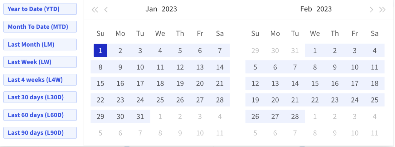
You can also use the Timeline Comparison feature to better understand your performance trends by analyzing period-over-period comparisons:
- Prior Period: Compare your selected date range to the period right before. For example, if the selected period is April, the prior period is March.
- Prior Year: Compare your selected date range to the same period in the previous year.
- Custom: Compare non-related time periods or date ranges of different lengths.

Additionally, you can quickly and easily isolate and understand the impact your PDM program has on consumers at different stages in their customer journey, whether they are Prospects, Customers, or part of a Custom segment.
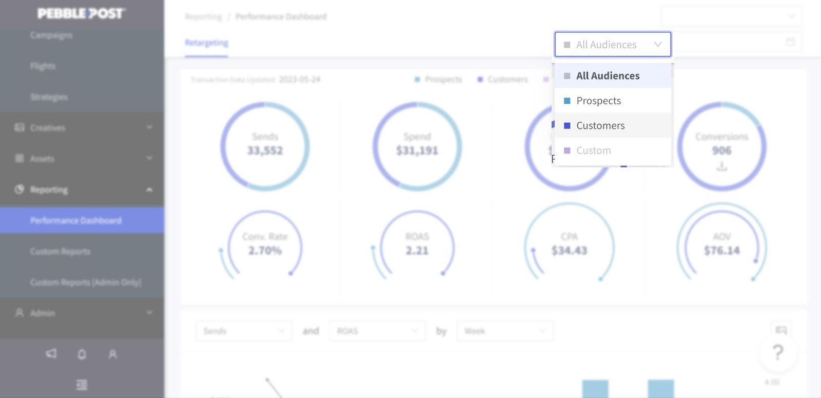
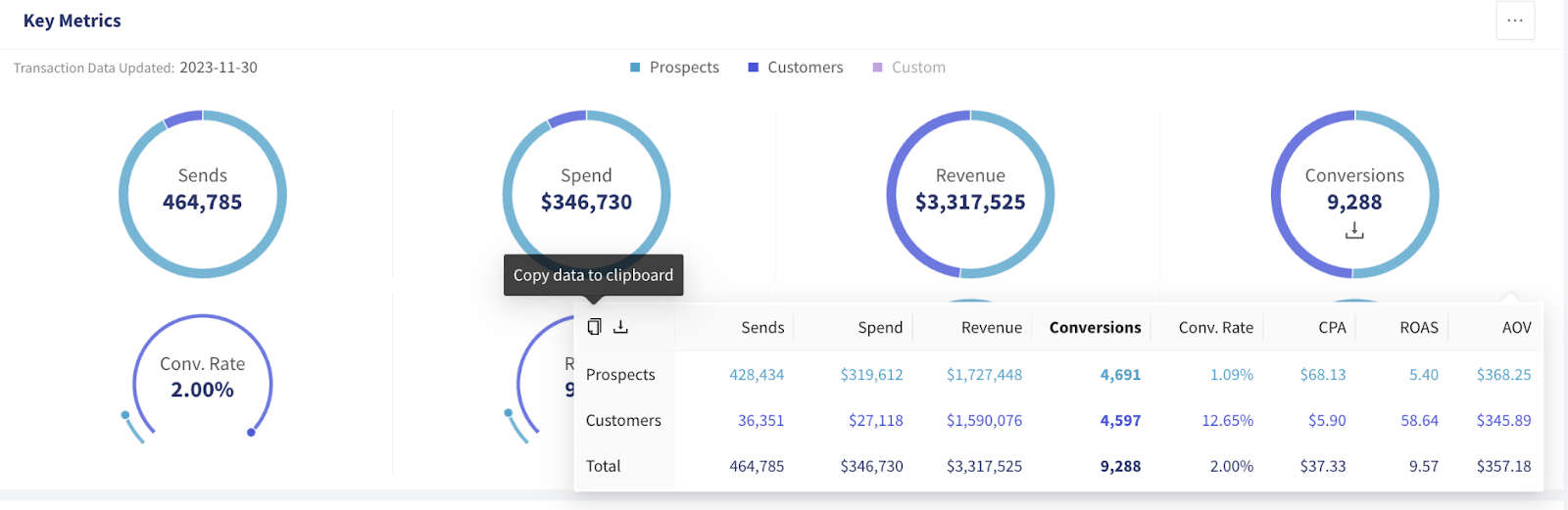
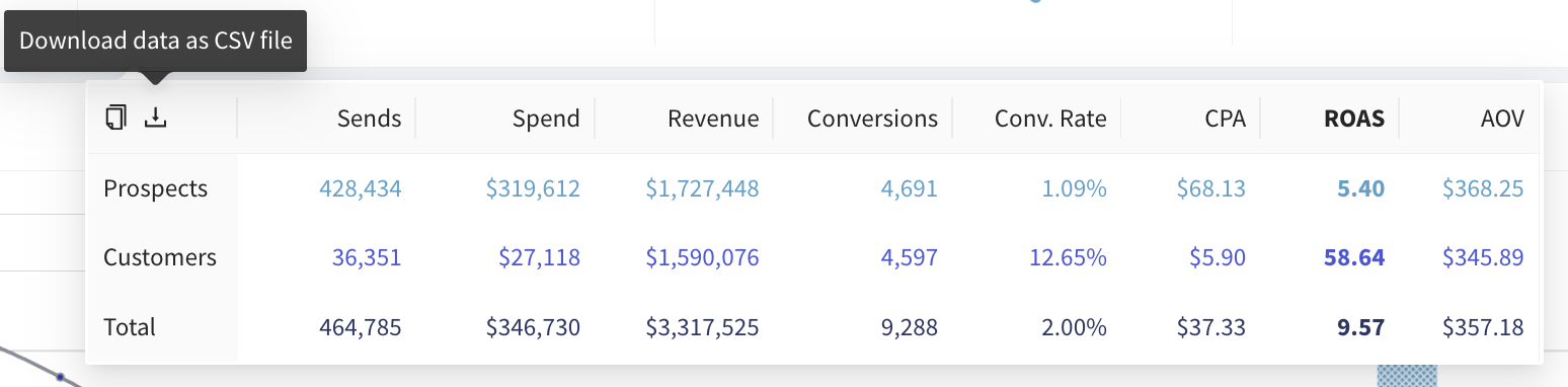
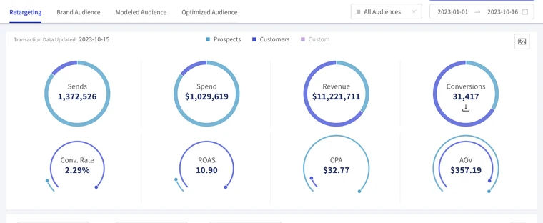
Topline Metrics
Available for all PebblePost products
Topline Metrics allow you to quickly and easily view the high-level insights associated with your PDM program like sends, spend, revenue, conversion rate, and ROAS.
The Performance Dashboard is powered by PebblePost’s comprehensive transaction match methodology, a unique measurement capability that connects both online and offline transactions back to a single household. The last date of transaction data that PebblePost has received from the brand is shown below the date range. We can receive transaction data from brands either via API (ie Shopify) or file transfers. If we are using APIs, the data should be up to date with the data in the brand e-commerce system. If the data is provided to PebblePost via file transfer, then the date reflects the latest data that has been shared with us.
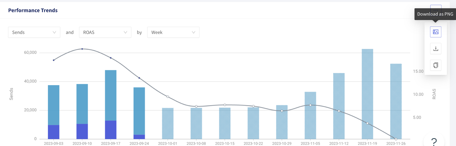
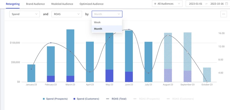
Performance Trends
Available for all PebblePost products
The Performance Trends graph makes it easy to customize performance data based on the
metrics that make sense for your business and analyze trends over time. You can select your desired spend metric and compare that to your desired revenue metric week-over-week or month-over-month across your desired time frame.
The Performance Trends graph provides a breakdown of cohort level analysis to showcase data that is fully vs. partially attributed.
- Blue bars represent data that is fully attributed with metrics specifically broken down by the week or month’s send data.
- Gray bars represent data that is not yet fully attributed, as mail is still going through that critical consumer consideration cycle.
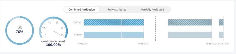
Lift Measurement
Available for Retargeting and Modeled Audiences.
The Lift Measurement graph gives you a quick view into the true impact of PebblePost’s optimization and technology on your performance over a control group. Within the Lift Measurement graph, you view lift for full, partial, or combined attribution. Given the longer attribution window of PDM, we recommend using partially attributed data to glean insights into the incremental lift generated by your PDM program much sooner so you have the confidence to make decisions when it matters.
Attribution Curve
Available for all PebblePost products
An attribution curve provides a seamless way for brands to analyze past and present performance of a brand’s desired metric within any given time frame. Given PebblePost’s longer attribution windows, when compared to digital channels, this also really helps convey the efficacy of our platform over time.
Attribution Curve use cases:
- Analyze how current performance is trending compared to previous performance
- View seasonal trends and historical trends
- Indicate abnormalities in performance
- Track how any optimizations we have implemented have positively affected performance

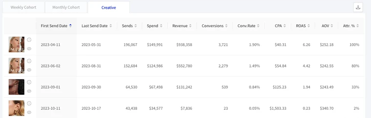
Detailed Breakdowns
This table provides your Topline Metrics broken down by weekly or monthly granularity and creative-level metrics. This view provides an at-a-glance look into metrics over time the performance of each creative used for the selected product type over the specified time period so you can identify creative best practices. For more granular insights, you can now filter the Reporting Dashboard by any given entity. For example, if you would like to filter for a specific campaign, simply click the name of the campaign in the table.
Data Sharing
The Reporting Dashboard offers a number of ways to share your reports so you can keep all key stakeholders in the loop on the performance of your PDM programs:
- Download graphs and charts from the dashboard with one click of your mouse. You can choose to download the data as a PNG of your graph, or download the raw data so you can recreate graphs in another tool.
- Copy graphs and charts from the dashboard with one click of your mouse so you can paste these visualizations directly into another document that can easily be shared to key stakeholders within your organization.
- Easily copy and share the dashboard URL with key stakeholders to give them direct access to the customized view of your Reporting Dashboard.